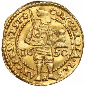
In 1650, at least two different sets of letter punches, differing in size, were used for creating ducat dies. The presented specimen illustrates the type with legends punched mostly in small letters. Some of them are characteristically distorted, e.g. the letters E in FOEDER or LEG.IMP on the reverse look like thick letters I. In the legend of the reverse, incorrect punctuation in the word PRO.VIN – interestingly, this error occurs only in lower case. The author of the beautiful stamps is Lucas Uyttenwael, for whom it was only the third year of work at the mint.
Mint condition. As is typical for the ducats of this province, the knight’s face and details are missing. Lots of gloss and clear, bold details, especially on the reverse.